Subpage Styles
Custom Buttons
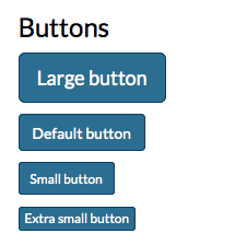
There are 4 custom button options for your site. You can highlight text in your content area, select the link icon to assign a link and then choose the button class from the formats menu. The three options are "button-large", "button-normal", "button-small" and "button-xmall".
*NOTE - These are the default site buttons. http://dev.navadiya.me/evershine/components.html displays the full list of bootstrap and theme buttons that can be used by adding the class to the link.
Forms
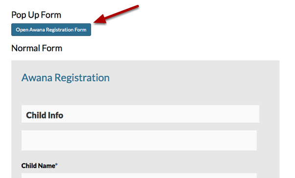
To display a form as a pop up form first insert the form on the page. Once the monklet for the form is on the page you will wrap the monklet in a div tag with the class "popup-form".
<div class="popup-form">{{tag="form" find="awana-registration"}}</div>